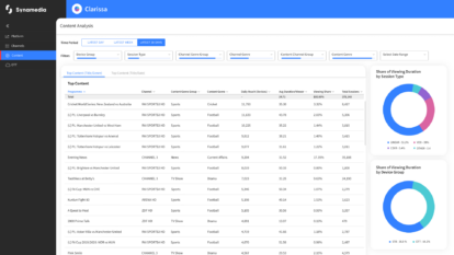
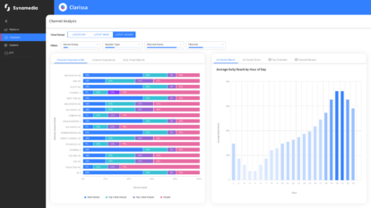
LONDON – October 5, 2022 – Synamedia, the world’s largest independent video software provider, today announced that Malaysia’s leading content and entertainment company, Astro Malaysia Holdings Berhad (Astro), has gone live with Synamedia Clarissa to gain a deeper understanding about how business decisions impact viewer behaviour and content consumption, with the goal of boosting engagement.
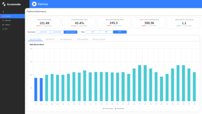
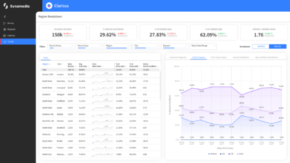
Astro is investing heavily in content and the user experience: using Clarissa’s all-encompassing view of its TV and video data it can measure the impact of these investments on the subscriber experience. For example, Clarissa allows Astro to change any element of their service and immediately see how this impacts other key performance indicators (KPIs) such as return-to-platform and average watch time. Providing this holistic view across all video and TV services, Clarissa empowers Astro’s business and operations teams to be data-led and insight-driven as they make more informed and impactful decisions.
Clarissa’s SaaS-based deployment model and built-in flexibility allowed Astro to go live in just six weeks and quickly make sense of the many ways its subscribers interact with its services. Understanding not just what people are watching but how they discover this content is one of the valuable insights Astro has already gained from Clarissa. Astro is currently using Clarissa to drive decisions on how to promote a new feature that improves content discovery with the goal of getting viewers to content quicker.
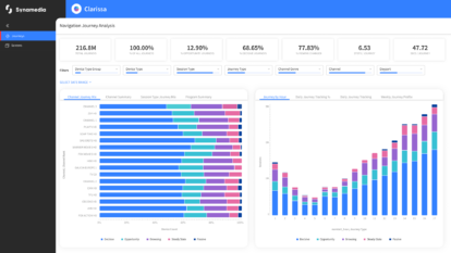
Astro is also using Clarissa to understand user navigation in order to better streamline a viewer’s journeys to the content they want to watch.
Euan Smith, Group CEO at Astro, said, “With Clarissa we have an enhanced ability to make smarter business decisions that will help us better understand and better serve our customers. With a unified view across all our user’s journeys, our business teams can quickly understand in detail how content is being searched and consumed, finding new connections in the data, and thereby understanding where we can add more value and relevance to our services. With our continued commitment to leadership in technology and services, Clarissa is a key new tool for us.”
Paul Segre, CEO at Synamedia, said, “Unlike traditional data analytics which start with the data to try and find value, Clarissa takes an insights-first approach which is already giving Astro the ability to better understand how its subscribers behave and how they interact with their services. The onboarding and adoption of Clarissa at Astro was seamless because the service was designed at the outset for the video sector, with the metrics and insights from Clarissa already aligned to Astro’s KPIs.”
Other technology developments at Astro
The Clarissa deployment at Astro follows hot on the heels of Synamedia Iris addressable advertising which uniquely provides unified targeting across linear and streaming video. Synamedia Iris went live on linear TV in July 2022, after earlier launches on the Astro GO on-demand service, Ultra 4K, and Ulti HD set-top boxes. Astro Addressable Advertising is the first such service in South East Asia and allows advertisers to show different ads to different households while they are watching the same programme based on data including location and demographics. As well as unveiling strong viewing stats, Astro has reported that big and emerging brands have reported a notable improvement in brand consideration and high brand awareness.
With live sports key to Astro’s success, Astro and Synamedia partnered with TeraVolt on the development of Astro Go Interactive Mode, which went live in 2021, giving sports fans an immersive viewing experience across all devices. The service has driven up streaming minutes and fan engagement with features including live auto-highlights, instant match stats and interactive timelines, and player and team rankings displayed as an overlay synchronised with the live stream.
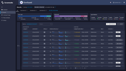
More recently, the Astro Go service became available on Smart TVs through a partnership between 3 Screen Solutions (3SS) and Synamedia, and Astro has gone live with Synamedia’s EverGuard managed service to protect its investment in premium content, including live sports.
About Astro Malaysia Holdings Berhad
Astro Malaysia Holdings Berhad (Astro) is Malaysia’s leading content and entertainment company, serving 5.7 million homes or 73% of Malaysian TV households, 6,700 enterprises, 16.8 million weekly radio listeners (FM and digital), 14.3 million digital monthly unique visitors and 3.0 million shoppers across its TV, radio, digital and commerce platforms. At Astro, we are committed to entertaining, informing and engaging with our customers through the best of local, regional and international content. As the largest content creator in the country, we produce and commission over 9,000 hours of local and vernacular content yearly, creating countless memorable moments for millions of Malaysians.
LinkedIn: https://www.linkedin.com/company/astro
About Synamedia and AWS Partnership
Synamedia Clarissa leverages a range of AWS Cloud services in conjunction with their data warehouse and reporting tools to effectively manage and analyze their data.
For press and analyst queries, please contact:
Rachel Postlethwaite
About Synamedia
We’re trusted by service providers and content owners to deliver, enrich, and protect video. The flexibility and agility of our cloud and SaaS products enable customers of all types and sizes to launch, monetise, and scale services at speed. Our award-winning portfolio includes advanced advertising, business analytics, broadband and streaming video platforms, intelligence-led anti-piracy, and video network cloud and software solutions. Synamedia is backed by the Permira funds and Sky.
Twitter: @SynamediaVideo
LinkedIn: Synamedia
