Launch on beIN’s linear channels across five markets
LONDON – May 20, 2024 – Leading video software company, Synamedia, today announced that beIN MEDIA GROUP (‘beIN’), one of the foremost global sports and entertainment broadcasters, has selected Synamedia Iris for the launch of a new broadcast advertising offering that is the first of its kind in the Middle East & North Africa (MENA).
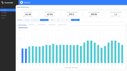
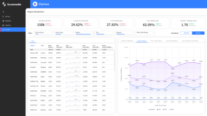
Using the Synamedia Iris addressable advertising platform, beIN will be able to create new, targeted advertising inventory at a country level. Initially available in Morocco, Saudi Arabia, UAE, Iraq, and Lebanon, with additional markets available later this year, beIN plans to extend its use of Synamedia Iris to its streaming services in 2025, making it easy for advertisers to deliver unified campaigns across both broadcast and digital inventory.
Using Synamedia Iris, beIN will be the first broadcaster in the region to open up opportunities for local advertisers and global brands to advertise their products and services to specific, local audiences alongside beIN’s world leading sports and entertainment line-up, maximising the value of their advertising spend.
Instead of delivering the same adverts across all 24 MENA countries it offers services to, beIN will use Synamedia Iris to expand its advertising offerings to target campaigns to specific countries and subsequently to targeted demographics and households.
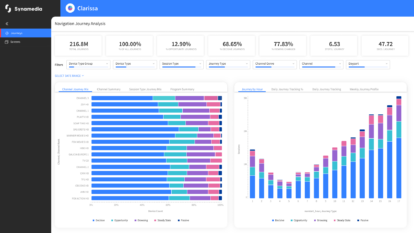
Available as Software-as-a-Service (SaaS), Synamedia Iris provides a single, unified platform for managing, delivering, and measuring advertising consistently across all devices, services, and screens. Synamedia Iris will enable advanced advertising across the entire beIN subscriber base, including satellite set-top boxes (STBs) without an internet connection, devices that would otherwise be left behind by other Connected TV advertising solutions.
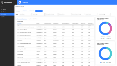
Synamedia Iris gives advertisers and media buyers complete control of their campaigns across all screens and modes of viewing. Its cloud-based infrastructure allows them to optimise campaign performance on-the-fly by adjusting campaign parameters to better meet business goals, all based on consistent measurement.
Bahadir Karalar, Director of Sales and Services at beIN, commented, “We chose to partner with Synamedia because its addressable advertising solution is proven to deliver uplifts in ad revenues elsewhere in the world. With best-in-class advertising technology and our unrivalled premium sports and entertainment content, we are confident that we have a compelling proposition that will attract both global brands and home-grown organisations to invest in this new form of targeted advertising which delivers the highest and most effective viewership.”
Guy Southam, Director of Advanced Advertising at Synamedia said, “With beIN becoming the latest major broadcaster to deploy Synamedia Iris, it’s time to change the mindset that advertising on TV in MENA is too broad to drive effective outcomes for local businesses. Using Iris, beIN can now offer a renewed proposition to new and existing advertisers, positioning global and local brands alongside the world’s greatest sporting moments.”
About beIN MEDIA GROUP
beIN MEDIA GROUP is a leading independent global media group and one of the foremost sports & entertainment networks in the world. The group distributes and produces an unrivalled array of entertainment, live sport and major international events across 5 continents, 40 countries and in 9 different languages spanning Europe, North America, Asia, Australasia and the Middle East & North Africa (MENA). beIN MEDIA GROUP’s flagship sports network, beIN SPORTS, holds the single largest portfolio of sports rights of any global broadcaster; and through its iconic MIRAMAX film studio, beIN holds an extensive library of Hollywood blockbusters while having a growing presence in series and movies production and distribution, as well as in the digital space. beIN MEDIA GROUP acquired Digiturk, the leading pay-tv operator in Türkiye, in August 2016, and in 2022 launched its premium OTT service, TOD, across MENA and Türkiye. For more information on beIN MEDIA GROUP, please contact: [email protected]. For advertising enquiries, contact: [email protected].
Synamedia press and analyst queries, please contact:
Rachel Postlethwaite
About Synamedia
We’re trusted by service providers and content owners to deliver, enrich, and protect video. The flexibility and agility of our cloud and SaaS products enable customers of all types and sizes to launch, monetise, and scale services at speed. Our award-winning portfolio includes advanced advertising, business analytics, broadband and streaming video platforms, intelligence-led anti-piracy, and video network cloud and software solutions. Synamedia is backed by the Permira funds and Sky.
Twitter: @SynamediaVideo
LinkedIn: Synamedia


