LONDON AND WASHINGTON D.C. – July 8, 2024 – Leading video software provider, Synamedia, today announced that NATO‘s Public Diplomacy Division will be using Synamedia D2C streaming technology to live stream NATO’s 75th anniversary summit to tens of thousands of viewers on its website and YouTube. The event will take place from July 9th to 11th in Washington D.C.
NATO selected Synamedia Quortex Play for future public events following trials to live stream events including ministerial meetings, the full 14 hours of this year’s NATO Youth Summit, as well as press conferences throughout May and June 2024. High quality and low latency streams were delivered to viewers through multiple channels including YouTube and NATO’s website, as well as via secure reliable transport (SRT) protocol to professional broadcasters, supported by Synamedia and its partner Diginet. These events received positive feedback from both NATO communications and operations teams and audiences.
NATO interpreters often provide simultaneous interpretation of public events into multiple languages. Quortex Play transcodes the audio from the simultaneous interpretation into multiple audio streams, allowing each viewer to choose their preferred language.
Paul Magis, Head of the Communications Technology Centre at NATO, said, “Using Synamedia Quortex Play we now have a reliable and versatile solution to stream live video through our NATO website and social media channels to audiences worldwide and in their own language.”
Other important features that impacted NATO’s decision include Quortex Play’s self-service, SaaS, cost-beneficial pay-as-you-stream model and its intuitive user interface, making it easy to prepare multiple streams in advance and to launch them in seconds.
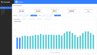
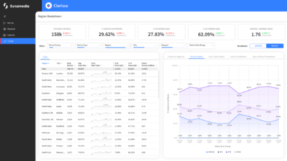
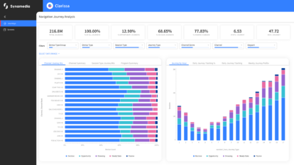
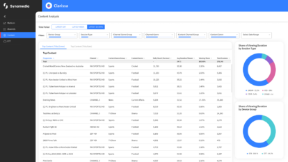
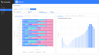
In addition, Quortex Play’s analytics give NATO the flexibility to optimise its streams in real-time to match viewer demand. For example, during a recent live stream, analytics revealed that a high number of viewers were watching on a low bit rate in Ukraine. On-the-fly reducing the resolution of those streams made it easier for those viewers to access the NATO streams.
Julien Signes, EVP of Video Network at Synamedia, said, “NATO is a pioneer in live streaming, showing other political and governmental organisations how they can open their events to a wider audience. While many organisations have used YouTube as their only channel to date, NATO sees the value in also publishing live streams on its own website and by using Quortex Play benefits from lower cloud costs, high reliability, scalability, and enhanced control of the viewers’ experience.”
Bart Delva, Broadcast Division Manager at DigiNet, commented, “As a Synamedia partner we are aware of how Synamedia Quortex Play’s just-in-time processing brings huge cost savings to anyone streaming video. It has been a pleasure working with NATO using Synamedia’s innovative technology and we look forward to supporting NATO in future as well as joining audiences around the world watching the live stream of the anniversary event in Washington D.C.”
Synamedia press and analyst queries, please contact:
Rachel Postlethwaite
[email protected]
About Synamedia
We’re trusted by service providers and content owners to deliver, enrich, and protect video. The flexibility and agility of our cloud and SaaS products enable customers of all types and sizes to launch, monetise, and scale services at speed. Our award-winning portfolio includes advanced advertising, business analytics, broadband and streaming video platforms, intelligence-led anti-piracy, and video network cloud and software solutions. Synamedia is backed by the Permira funds and Sky.
Twitter: @SynamediaVideo
LinkedIn: Synamedia


